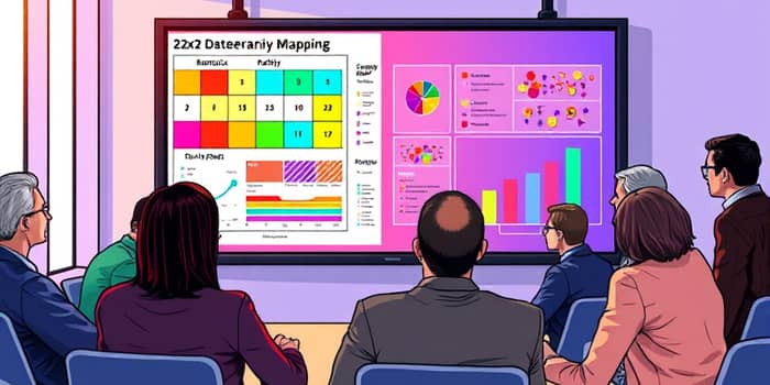
In a world defined by rapid change and constant uncertainty, the ability to anticipate multiple futures can be transformative. Scenario mapping with charts empowers teams to prepare for multiple possible outcomes and make informed decisions under pressure.
Scenario planning is more than a forecasting exercise; it’s a structured approach to imagining diverse futures. By selecting critical uncertainties—such as market demand and regulatory shifts—and treating them as axes, you can construct a visual map that captures four distinct scenarios. This method encourages teams to develop narratives, identify risks, and design strategies before events unfold.
At its core, scenario planning builds resilience. When you forecast a range of scenarios, your organization moves from reactive to proactive, allocating resources and preparing contingencies across different possible worlds.
Once uncertainties are defined, mapping begins. The classic 2x2 matrix places one uncertainty on the X-axis and another on the Y-axis, creating four quadrants:
Each quadrant becomes a canvas for visual data: projected revenue, risk heat maps, staffing requirements, and supply chain vulnerabilities. By overlaying quantitative and qualitative insights, teams craft memorable narratives for each scenario and guide strategic planning sessions effectively.
Different charts serve distinct purposes in scenario mapping. Selecting the appropriate type ensures clarity and impact.
To streamline your process, free templates are available in multiple formats, including Excel, PowerPoint, and Google Sheets. Popular options include:
Many advanced scenario modeling tools now offer interactive dashboards and dynamic adjustment of key variables, making it easy to update charts in real time and enhance stakeholder engagement and alignment.
Choosing the right variables turns a generic chart into a powerful decision-support tool. Common metrics include:
Quantitative scenario charts often assign probabilities—best-case (25%), worst-case (25%), and baseline (50%)—to help decision-makers weigh options and drive comprehensive data-driven decision support.
Adhering to best practices ensures your charts deliver maximum insight and usability:
When you follow these guidelines, scenario charts become not just presentations, but living tools that guide strategic decisions through uncertainty.
Imagine a fast-moving consumer goods (FMCG) company uncertain about regulatory changes and consumer demand in a post-pandemic market:
X-axis: Regulatory Restriction (Low–High)
Y-axis: Consumer Demand (Low–High)
They map four quadrants:
For each scenario, the team overlays:
By translating complex data into clear visuals, the FMCG team gains visualizing data in real time and crafts robust strategies even when the future is uncertain.
Incorporating these methods into your organization fosters adaptability, sparks innovation, and builds confidence across teams. As you master chart-driven scenario mapping, you transform uncertainty from an obstacle into an opportunity.
References


